
Considering price is a crucial step in the buyer's journey, so it's important to get your pricing page right. You will see a good lead conversion rate on your pricing page if:
- It clearly and simply communicates your pricing structure
- It concisely sums up the value of your product/service
- It entices the lead to begin the sales process
In this post I'll cover the different elements you can have on a pricing page, what makes good pricing page content and how to design an effective pricing page. I'll also go through some good examples of SaaS pricing pages.
Pricing page elements
Before you build your pricing page, you need to consider which elements you want on it. This decision will be informed by how complicated your pricing information is. You may even choose to spread the content over several pages with an overview page and a page for each package.
A basic pricing page should include the following:
- Pricing table
- Targeted buyer persona sentence for each package (e.g. 'Ideal for small businesses/growing businesses/enterprises')
- 'Sign up' call-to-action (CTA) or equivalent
- 'Contact us' CTA
- Short and snappy value statement (reiterate why the lead should become a customer – what problem are you solving for them?)
Some other features that can be effective on a pricing page are:
- FAQs
- Price calculator
- Testimonials
Pricing page content
The content of your pricing page should:
- Build trust with the lead
- Communicate the value of your product/service – your unique selling point (USP)
- Clearly explain the differences between pricing packages – they should be easy to compare
- Target your buyer personas by making it easy for them to choose the right package
- Use simple, common language that the lead will understand – no jargon
- Be concise – only show the most important content and have links to pages with more details if required
- Be transparent and set up expectations about cost, billing and the sales process
- Entice the lead to take the next step
Pricing page design
To ensure a good user experience, a pricing page design should:
- Be clean, simple and intuitive to use
- Be easy to scan for information
- Visually differentiate between each package
- Direct the lead to take the next step (emphasise CTAs)
- Use dynamic content to personalise the page's sales pitch (e.g. changing a 'Sign Up Now' CTA to 'Upgrade Now' for existing customers)
- Include a currency selector if your product/service is sold in different regions
4 SaaS pricing page examples
1. MailChimp
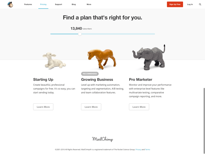
Why this page works
- It has a scalable pricing slider that recommends the right plan for each buyer persona based on number of subscribers
- It uses fun images to represent each package, aligning with the brand's identity
- Its design is simple and the content concise, directing the lead to learn more on another page once they work out which plan is best for them
- It tells the lead how each plan will add value to their lives
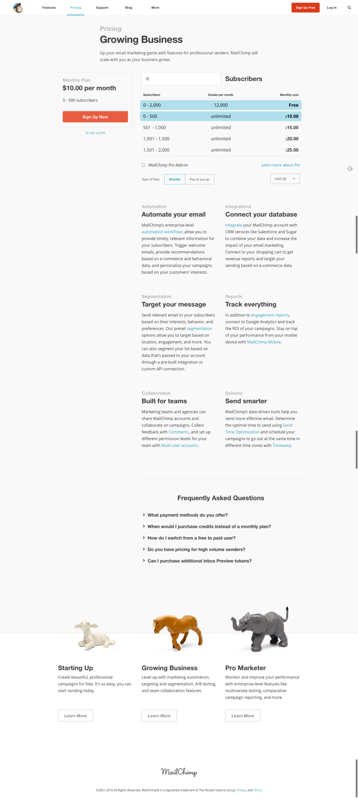
Why this page works
- The 'Sign Up Now' CTA stands out
- It includes a price calculator to simplify the pricing structure, making it transparent and easy to understand
- It has a currency selector
- It describes the benefits of the plan, enticing the lead to sign up
- It includes FAQs about the pricing structure and the sales process to set expectations and clear up any confusion
- It ends with links to view the details of other plans so the lead can compare them
2. HubSpot
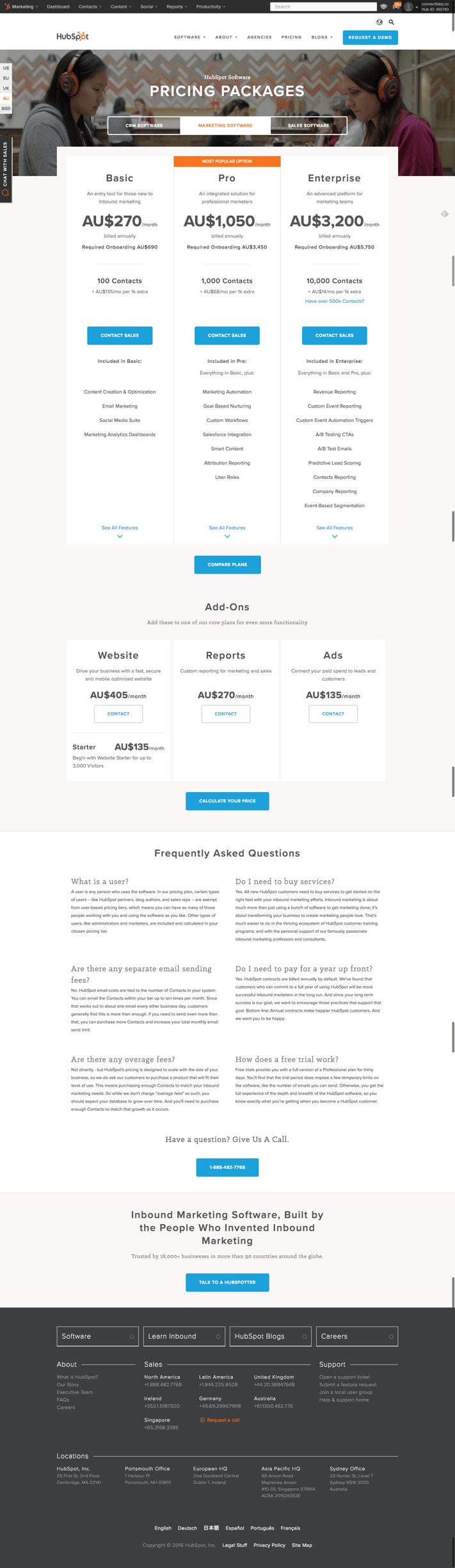
Why this page works
- Each package targets the relevant buyer persona with a simple sentence that describes who that package is for (e.g. "An entry tool for those new to inbound marketing")
- It has a currency selector
- It has dynamic content: the relevant currency is automatically selected according to the visitor's IP address
- The differences between each of the three packages are clear
- There's an option to compare the plans in more detail (great for more complicated offers)
- The 'Contact Sales' CTAs stand out
- The features list is a concise summary, with a link to see all of the features
- It has a pricing calculator to simplify it even further
- There's an FAQs section to help clarify any points of confusion and reassure the lead
3. Slack
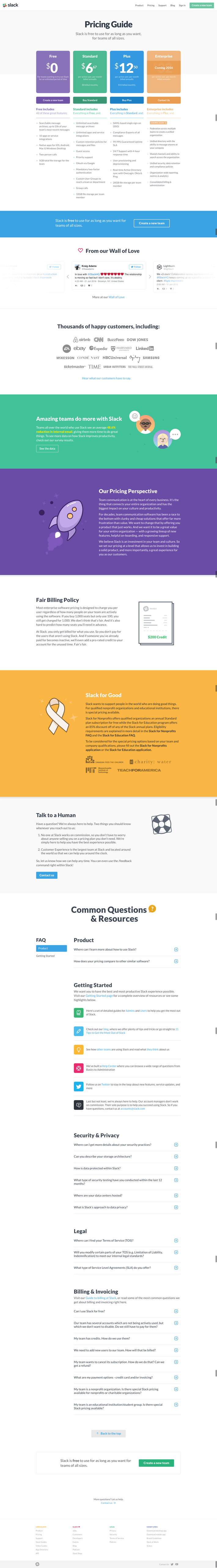
Why this page works
- It builds trust and assuages doubts by reassuring the lead that Slack won't bill them unexpectedly ("free to use for as long as you want, for teams of all sizes") and that their billing policy is fair
- It tells the lead which buyer persona each package is ideal for when you hover over the pricing boxes
- It uses colour to visually differentiate each package
- It has dynamic content: the banner CTA 'Create a new team' only appears if you aren't already signed up
- It features testimonials from satisfied customers to reassure the lead that Slack is a good service and a trusted company
- It reminds the lead why Slack is a valuable service
- It shows that Slack is a caring and charitable brand that supports "people in the world who are doing good things"
- It includes FAQs to reassure and convince hesitant leads
4. Culture Amp

Why this page works
- It opens with an enticing statement about the service's value: "Start building better company culture"
- The content targets each buyer persona ("Ideal for…")
- The content is simple and concise, with a link to learn more
- The design is clean and simple
- It uses graphics to good effect
- It directs the lead to take the next step and 'Get Started'
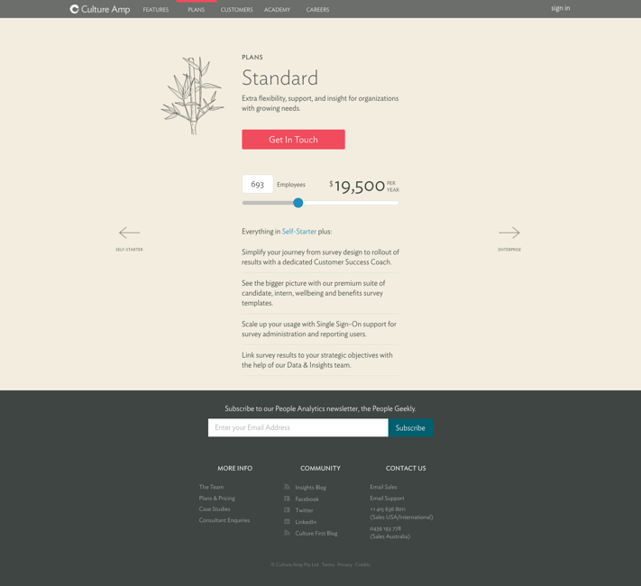
Why this page works
- It targets a buyer persona: "Extra flexibility, support, and insight for organizations with growing needs"
- It has a scalable pricing slider to easily calculate price
- The 'Get in Touch' CTA stands out
- It describes the value of the plan
- The design is simple and clean
- The content is concise
- You can easily navigate to the Self-Starter and Enterprise pages to compare plans
Conclusion: pricing page best practice
A high performing pricing page will:
- Build trust by being transparent and reassuring any doubts
- Have an intuitive, clean design that is easy to scan
- Communicate the value of your product/service
- Use simple language that the lead will understand
- Be informative and concise
- Target your buyer personas
- Use CTAs that stand out
And don't forget to continuously test your pricing page to ensure optimal performance.