When it comes to attracting new students to your course, having a strong website that provides a good user experience is a crucial first step. Your website will likely be the first impression your school makes on prospective students and parents, so you're going to need to invest time to make that impression count.
We've already done a 101 for education website design on our amazing blog, but this time we're going to analyse five examples of education websites to see how they help, or maybe detract, from enrollments.
PrepGenie
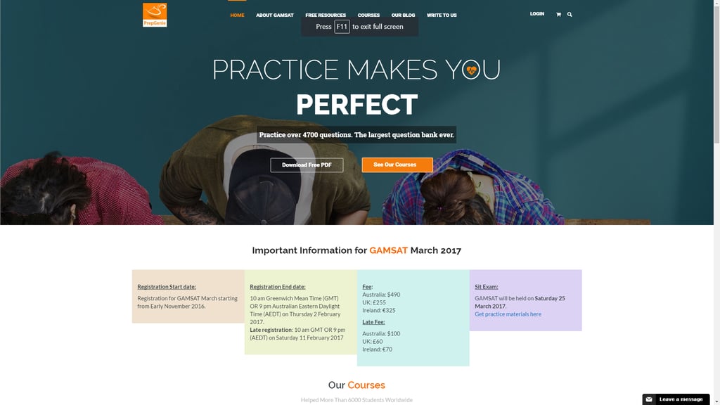
PrepGenie offers courses to help prepare students for the GAMSAT.
Pros
- No-nonsense approach to providing information, with key information such as enrollment dates and costs easily visible. This approach is possible due to the school's specific set of courses that cater to students who likely already know what they are looking for.
- Uses the entire width of the page without appearing too cluttered.
- Easy navigation to additional information about the courses including a PDF download button that doesn't impose on the page.
- Colour scheme provides an impression of professionalism suited to school's personality.
Cons
- Headline image doesn't fit the space very well.
Academies Australasia
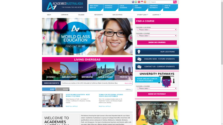
Academies Australasia offers a variety of courses for both international and local students in Australia and abroad.
Pros
- Ability to navigate to key information – it's clearly visible and easily accessible.
- Uses a vibrant colour scheme without appearing too loud or unprofessional.
- Targets their international student audience well; uses guides to living in Australian cities to help build brand trust.
- Has a broad range of information on the homepage, so there's something of interest for every buyer persona.
Cons
- Not enough whitespace (negative space) – the different page elements are crammed together, overwhelming the visitor with options.
- The footer is way too long.
James An College
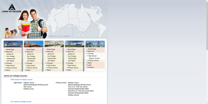
James An College is a coaching college that provides tuition to primary and secondary school students.
Pros
- Knows its audience – simple layout and design works better with the older audience (parents) who visit the site.
- Important information that visitors will want to see can be navigated to from the homepage.
Cons
- Design is very outdated, reflecting poorly on the brand.
- Layout is too cramped, making finding specific information more difficult for visitors.
- Not optimised for all screen sizes and not mobile friendly.
Kip McGrath Education Centres
Kip McGrath is an international franchise of tuition centres for primary and secondary school students.
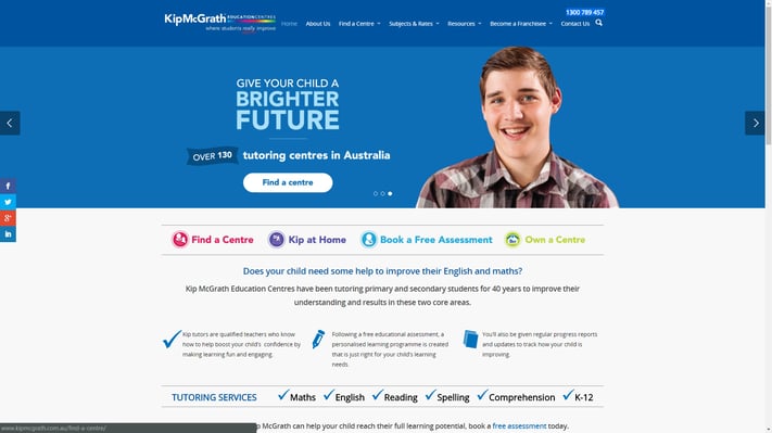
Pros
- Clean design doesn't overwhelm the visitor with unnecessary information.
- Crucial information can be easily navigated to from the homepage.
- Simple colour scheme/layout suits the target audience (parents).
- Clear calls-to-action, helping to generate more leads.
- Likely to generate an overall positive user experience and consequently more leads.
Cons
- Overuse of stock imagery. Unique, authentic imagery generates a stronger and more lasting impression and is more successful at building trust.
Kangan Institute
Kangan Institute is an Australian institution that offers TAFE level courses.
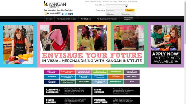
Pros
- Vibrant colour scheme creates a warm impression of the brand and is suited for the target demographic (students).
- Key information can be easily navigated to and searched for on the homepage.
- Authentic imagery creates a better impression of the school compared to stock photos.
- Links to the school's social media channels are easily accessible.
Cons
- Main header design isn't great.
- Cluttered design is visually confusing.
Education website design best practices
From these five examples, we can see that there are some common practices that all education websites need to follow:
- Having an appropriate layout and colour pallet.
- Ensuring that all key information is easily accessible.
- Knowing (and designing for) your target audience.
If you'd like some help with this, don't hesitate to get in touch with us, we've been trying to help many businesses take decisions that best works for them.

September 21, 2016

